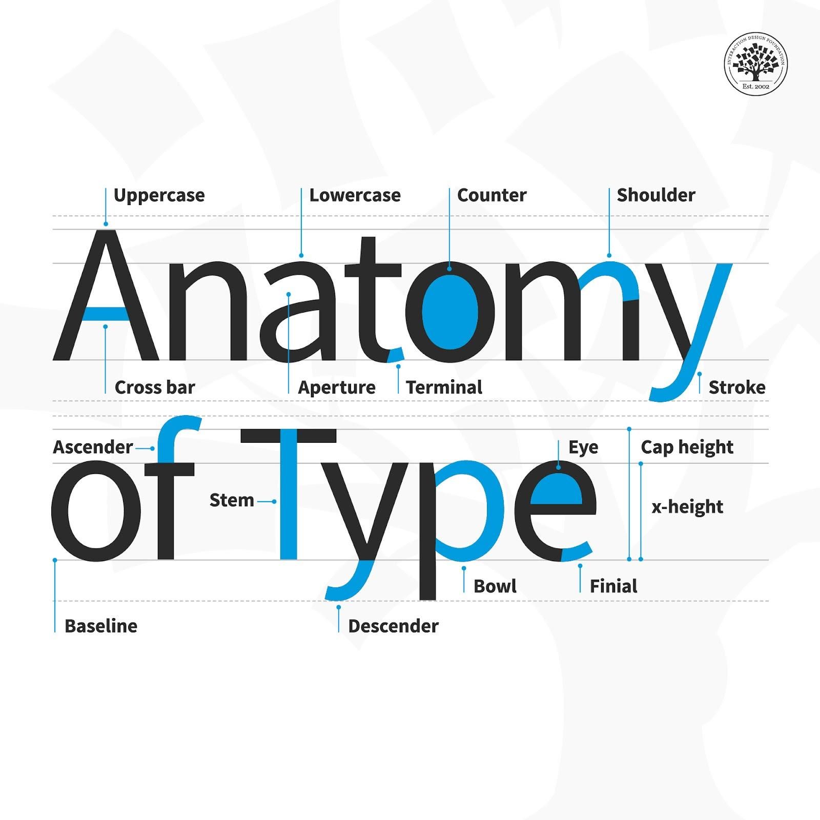
The anatomy of type describes the visual elements that make up the letterforms within a typeface. Each letterform is made up of individual components (e.g., spine, stem, stroke). Type designers create typefaces using components — crucial parts that contribute to the overall appearance and legibility of a typeface.
ShowHide
video transcript
Transcript loading...
“Typography is an art. Good typography is art.”
— Paul Rand, Art director and graphic designer whose logos include IBM
Learn more about what type is and what it means to design.
Your text plays a vital role in carrying the right message to your users. Not only are the words you choose important; the typographic choices you make such as font style and how you lay out your text onscreen are equally vital, too. So, it’s important to have an understanding of what goes into the type that you select. Be it for a website headline, a call-to-action button or a host of other functions, when you break type down to the anatomical level, you’ll have the building blocks to create a more legible and readable experience for your users. These are the terms to have in your “type dictionary” so you better understand how type is created and how to use it effectively in your work:
Aperture: The partially enclosed space of a letterform.
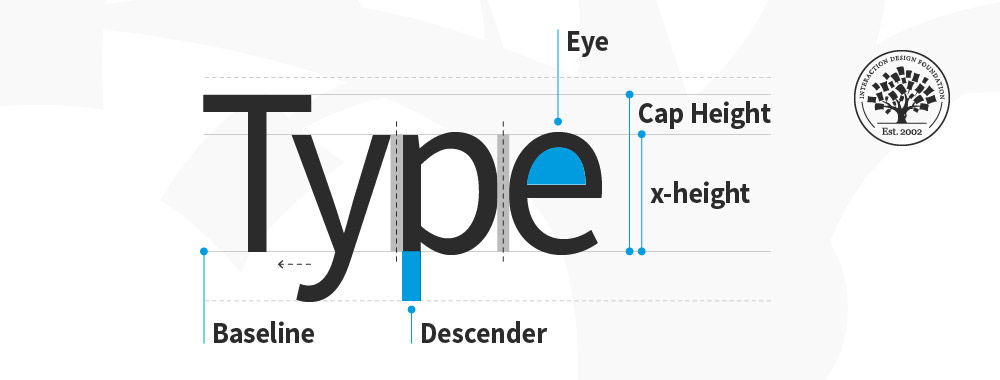
Ascender: An upward vertical stroke that extends beyond the x-height.
Baseline: The invisible line on which all letters rest.
Bowl: The generally round or elliptical forms which are the basic body shape of letters.
Cap height: The distance from the baseline to the top of the capital letter.
Counter: The white space enclosed by a letterform.
Cross bar: The horizontal stroke in letters.
Descender: A downward vertical stroke that extends beyond the baseline.
Dot: Also known as a tittle, is a small diacritic on a lowercase i or j.
Eye: The closed counter of a lowercase e.
Finial: A tapered or curved end on a letterform.
Ligature: Two or more letters tied into a single character.
Lowercase: A smaller form of letters in a typeface.
Shoulder: A curved stroke originating from a stem.
Spine: The main curved stroke of a lowercase or capital letter.
Stem: A main stroke that is more or less straight, not part of a bowl.
Serif: A stroke added to the beginning or end of one of the main strokes of a letter.
Small Capital: Short capital letters designed to blend with lowercase text.
Stroke: A straight or curved line that creates the principal part of a letter.
Terminal: A circular form at the end of the arm, leg or brow in letters.
Uppercase: A typecase containing capital letters.
x-height: The distance between the baseline and the height of the lowercase letter ‘x’.
Here are some helpful points to consider with the finer points of type:
Kerning – This is the adjustment of space between two individual letters. An example of bad kerning is when you use a font that has the letters so close together that (e.g.) what you typed as “kerning” shows up as “keming” (the letters get mashed together). It’s better to devote time to kerning with larger text and headlines (as opposed to smaller text and body copy). Also, if you kern one headline, be consistent and kern the others.
Tracking – This is the adjustment of space between a whole group of letters (rather than each one, as in kerning). You can fine-tune tracking by compacting or expanding this space to optimize your text.
Leading – This is the adjustment of vertical space between lines of text. While the default is typically fine, you can always fine-tune leading to make text extra-comfortable to read for your users.
Legibility – This refers to how easy it is to distinguish one letter from another in a particular typeface. This is the most fundamental consideration because you’ll know at a glance how legible your text is.
Readability – This refers to how comfortably users can read your text. Although they may be able to make out each letter, a poor choice of (e.g.) small caps use and font can slow users down or turn them off completely from proceeding with your design or product.
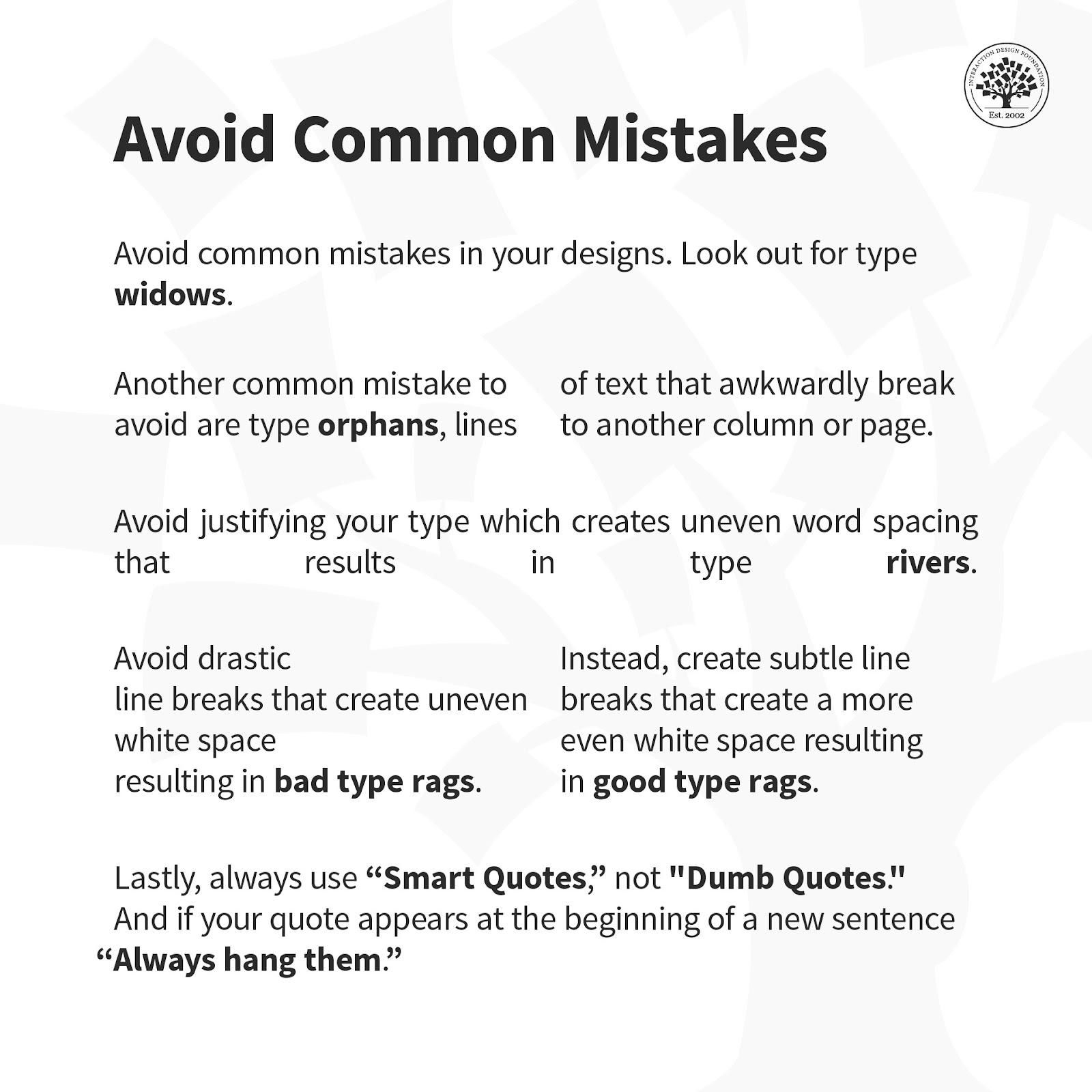
Here is a helpful list of common mistakes to avoid when designing with type.
Overall, remember that the best designs are ones where users don’t stop to think about what you’re trying to show them. That’s why your typography not only has to complement the well-thought-out wording of your messages as well as the other design elements such as your images. Text needs to present well at both the micro and macro levels, too, hence why typographic knowledge is vital to design.
In this course, you will gain a holistic understanding of visual design and increase your knowledge of visual principles, color theory, typography, grid systems and history. You’ll also learn why visual design is so important, how history influences the present, and practical applications to improve your own work. These insights will help you to achieve the best possible user experience.
In the first lesson, you’ll learn the difference between visual design elements and visual design principles. You’ll also learn how to effectively use visual design elements and principles by deconstructing several well-known designs.
In the second lesson, you’ll learn about the science and importance of color. You’ll gain a better understanding of color modes, color schemes and color systems. You’ll also learn how to confidently use color by understanding its cultural symbolism and context of use.
In the third lesson, you’ll learn best practices for designing with type and how to effectively use type for communication. We’ll provide you with a basic understanding of the anatomy of type, type classifications, type styles and typographic terms. You’ll also learn practical tips for selecting a typeface, when to mix typefaces and how to talk type with fellow designers.
In the final lesson, you’ll learn about grid systems and their importance in providing structure within design. You’ll also learn about the types of grid systems and how to effectively use grids to improve your work.
You’ll be taught by some of the world’s leading experts. The experts we’ve handpicked for you are the Vignelli Distinguished Professor of Design Emeritus at RIT R. Roger Remington, author of “American Modernism: Graphic Design, 1920 to 1960”; Co-founder of The Book Doctors Arielle Eckstut and leading color consultant Joann Eckstut, co-authors of “What Is Color?” and “The Secret Language of Color”; Award-winning designer and educator Mia Cinelli, TEDx speaker of “The Power of Typography”; Betty Cooke and William O. Steinmetz Design Chair at MICA Ellen Lupton, author of “Thinking with Type”; Chair of the Graphic + Interactive communication department at the Ringling School of Art and Design Kimberly Elam, author of "Grid Systems: Principles of Organizing Type.”
Throughout the course, we’ll supply you with lots of templates and step-by-step guides so you can go right out and use what you learn in your everyday practice.
In the “Build Your Portfolio Project: Redesign,” you’ll find a series of fun exercises that build upon one another and cover the visual design topics discussed. If you want to complete these optional exercises, you will get hands-on experience with the methods you learn and in the process you’ll create a case study for your portfolio which you can show your future employer or freelance customers.
You can also learn with your fellow course-takers and use the discussion forums to get feedback and inspire other people who are learning alongside you. You and your fellow course-takers have a huge knowledge and experience base between you, so we think you should take advantage of it whenever possible.
You earn a verifiable and industry-trusted Course Certificate once you’ve completed the course. You can highlight it on your resume, your LinkedIn profile or your website.
Typography has its very own language. It’s full of typographic terms that make up its basic anatomy. Just like it’s vita
674 shares
1 mth ago
Open Access - Link to us!
We believe in Open Access and the democratization of knowledge. Unfortunately, world class educational materials such as this page are normally hidden behind paywalls or in expensive textbooks.
If you want this to change,
, link to us, or join us
to help democratize design knowledge!