Color modes are the settings designers use to show colors consistently across devices and materials. Commonly used modes are LAB, RGB, CMYK, index, grayscale and bitmap, which differ in quality and file size. Designers pick modes to optimize images and ensure these appear identically across media for brand consistency.
“The main function of color should be to serve expression.”
— Henri Matisse
Learn about the intricate properties of color here.
ShowHide
video transcript
Transcript loading...
How to Achieve Color Consistency and More in Screen and Print
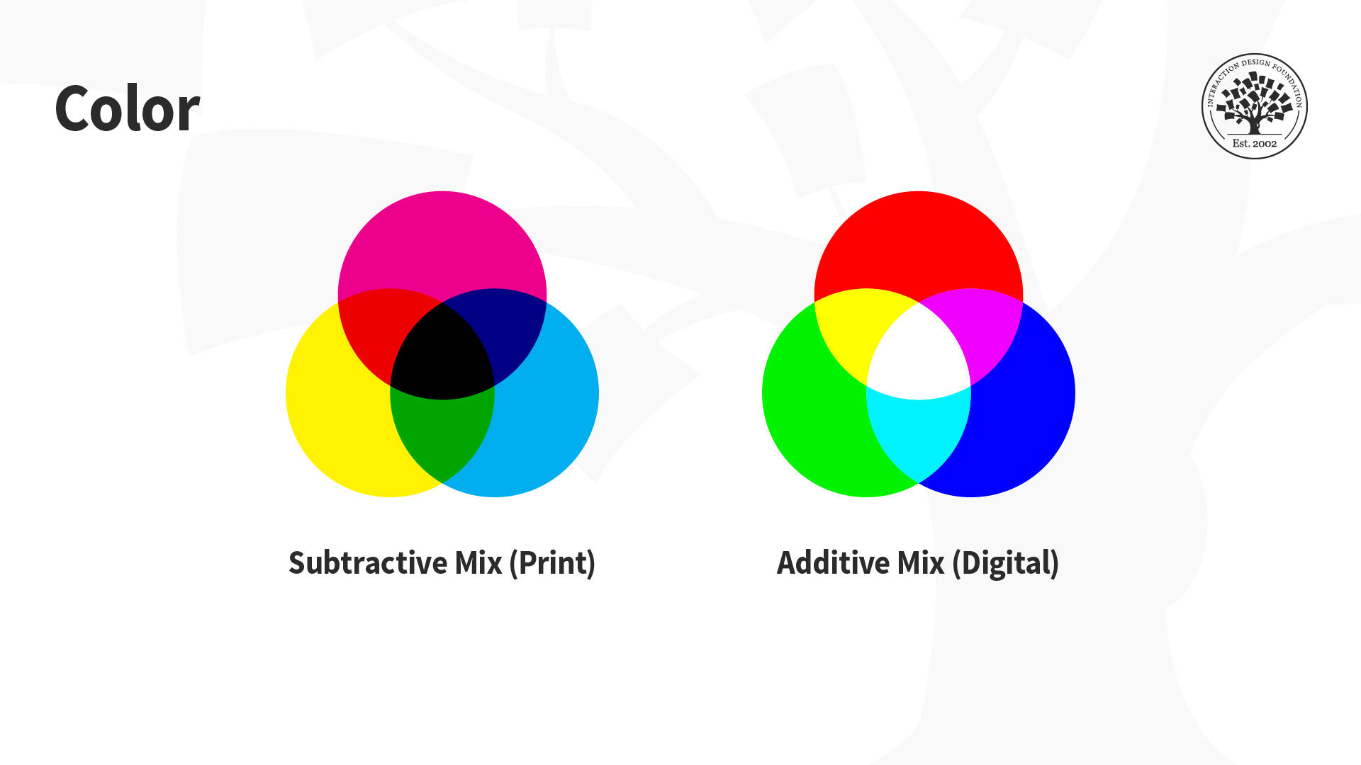
The designs we create appear on many devices and materials, and how we manipulate color greatly depends on the medium we use. This is due to differences in color spaces (i.e., the specific organization of colors), and the two processes for producing color, namely:
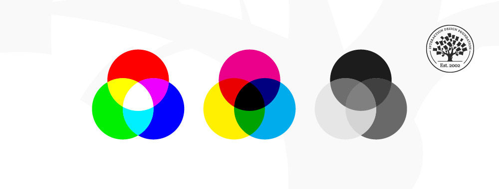
Additive: Involves the blending of light. We “create” white by mixing all the colors at full intensity; black is the total absence of color.
Subtractive: Involves mixing physical substances (e.g., ink, paint). Each dot/splotch covers the medium (e.g., paper). A classic example of mixing all paint colors is that curious dark grey-brown hue.
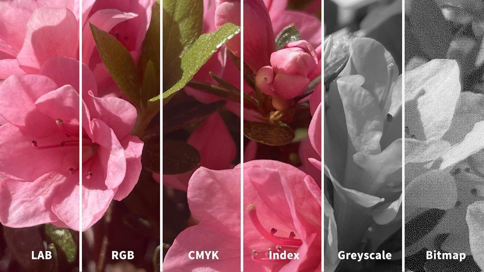
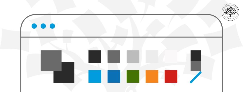
You may have seen how printed-out colors can look different from those on-screen. This phenomenon happens because the printer’s colors (using the subtractive process) didn’t replicate the screen’s (using the additive). Such inconsistencies can be easy to correct if you choose the suitable color mode. The illustration below depicts the difference between LAB, RGB, CMYK, Index, Greyscale and Bitmap color modes. You’ll notice how the quality from left (LAB) to right (Bitmap) decreases as the amount of color decreases.
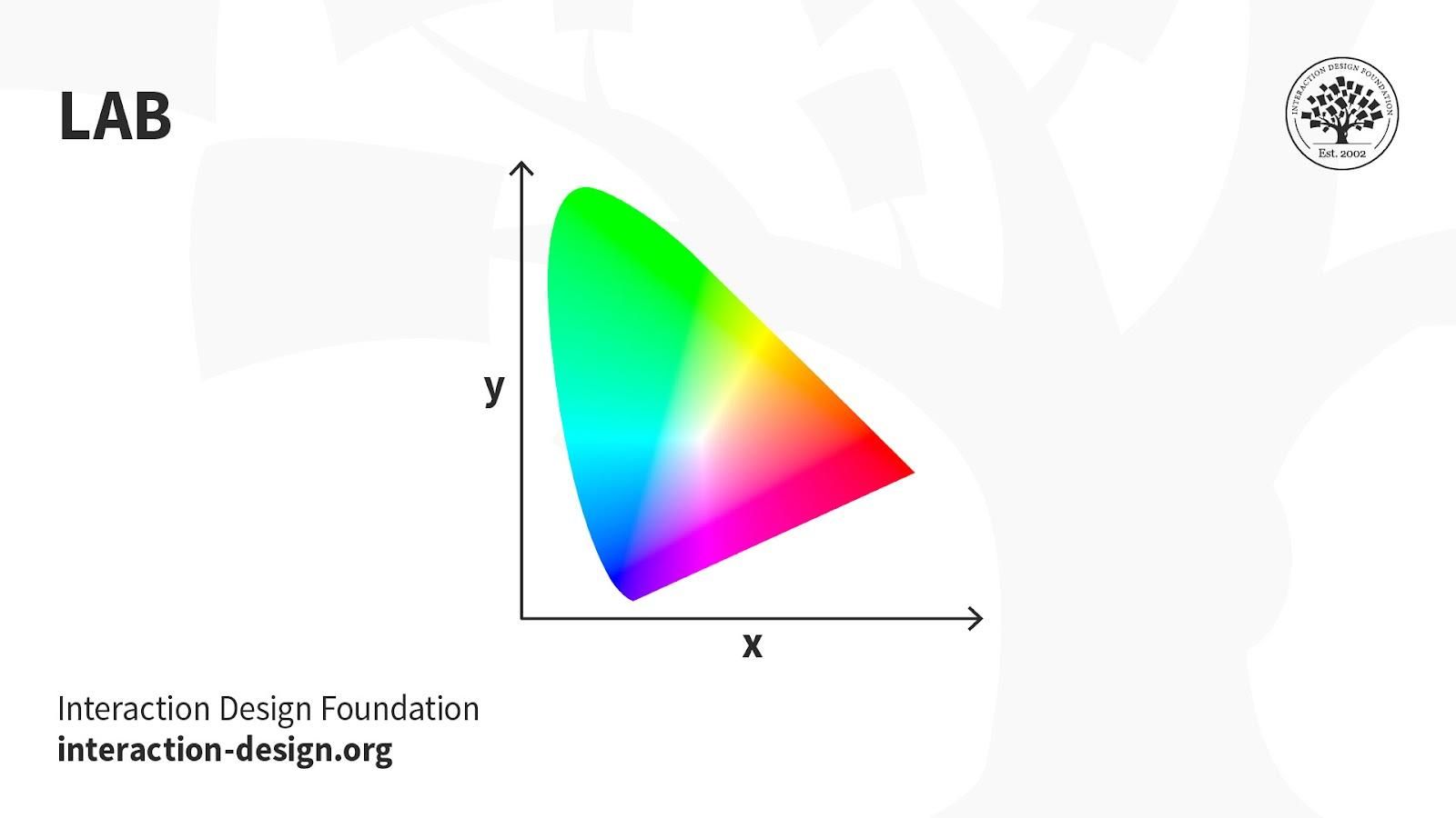
LAB: Also called CIELab, LAB is based on how humans perceive color. It comprises one channel for lightness (L, ranging from the values 0–100) and two for color (A—the Green-Red Axis channel—and B, the Blue-Yellow Axis channel, ranging from +127 to -128).
LAB color is device-independent, making it easy to achieve precisely the same color across different types of media so your (e.g.) digital logo appears identically on a mug, banner, etc. However, LAB’s large file sizes can delay load times.
Uses:
Branded Products (e.g., T-shirts, banners).
Color Reference.
Photography.
Improving images with a natural and vibrant look.
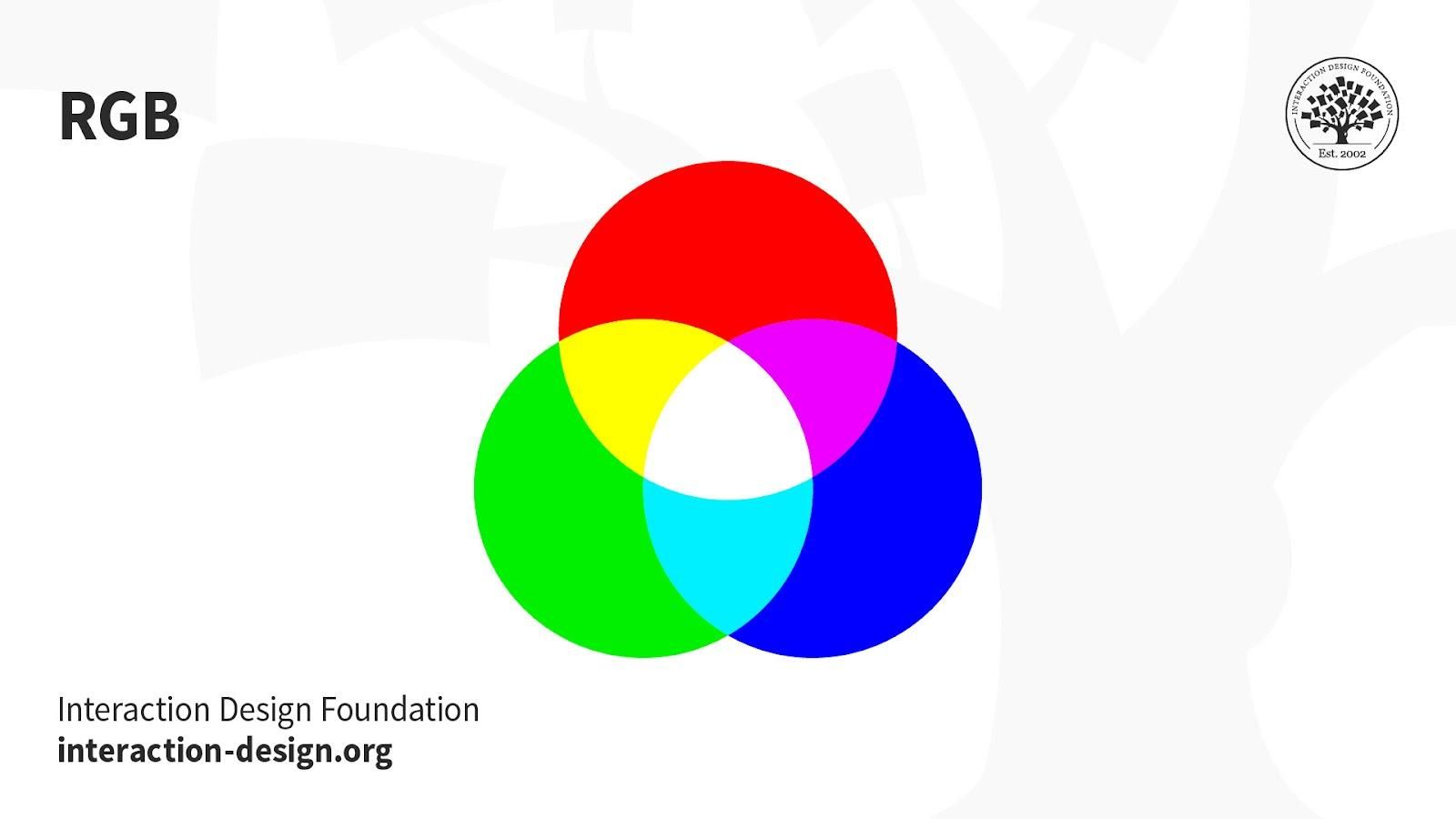
RGB: This color mode uses the additive process. It comprises Red, Green and Blue hues that combine to create extensive color variations.
RGB exists exclusively in digital formats (e.g., mobile screens). Although RGB is present across most electronic devices, the color elements vary across systems and models. So, an image can display differently on-screen from brand to brand.
Uses:
Web & App Design.
Digital Design.
Social Media.
Online Advertisements.
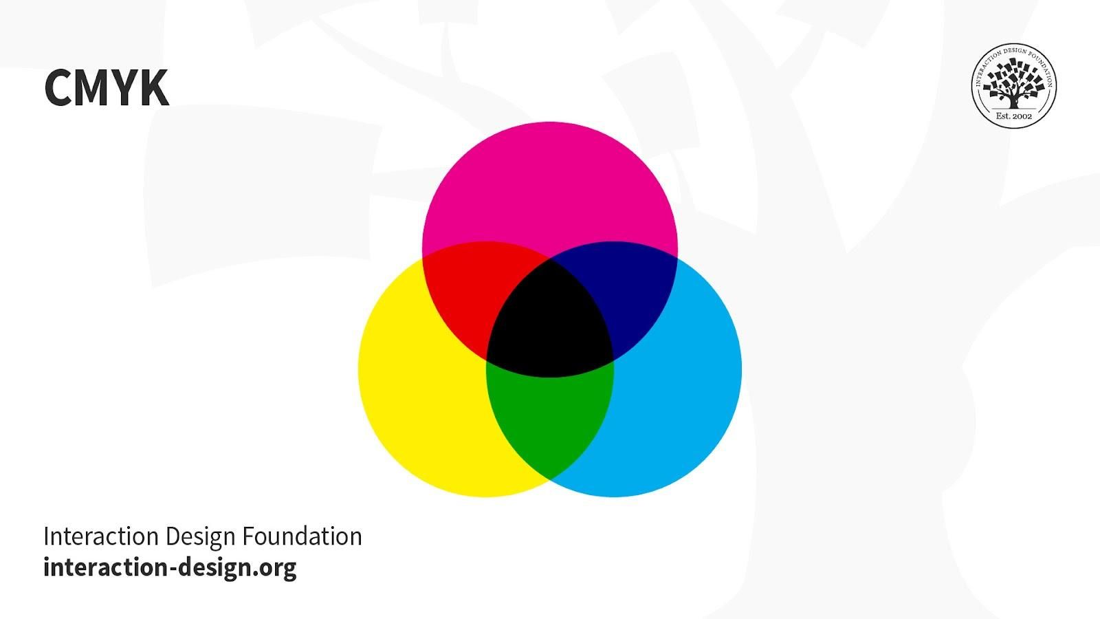
CMYK: This subtractive color mode comprises Cyan, Magenta, Yellow and Key (Black), which combine to produce a range of hues. This four-color process works for most printers.
Printed images are a series of layered four-color dots (measured in dots per inch) that create different hues and gradations. Although CMYK is a standard color model, the exact range of colors represented can vary depending on the press and printing conditions.
Uses:
Stationery (e.g., business cards).
Advertising (e.g., posters, flyers, brochures).
Product Packaging.
Tip—Use CMYK mode when preparing an image to be printed with process colors, as image conversion from RGB to CMYK creates a color separation. If you start with an RGB image, it’s best to edit first in RGB and then convert to CMYK afterward.
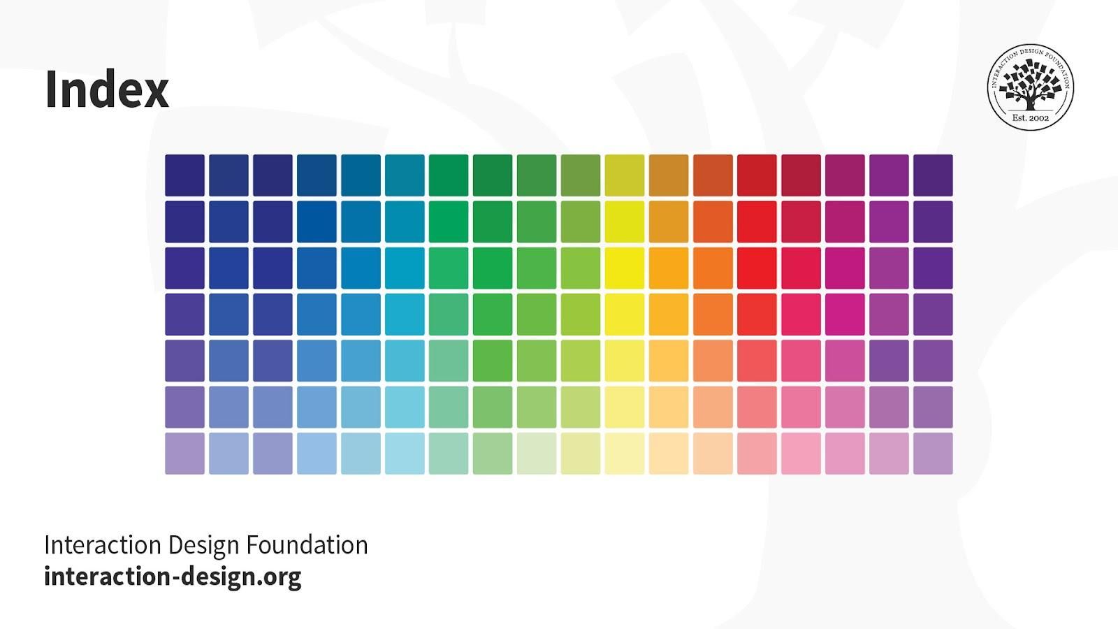
Index: This mode produces 8‑bit image files with up to 256 colors. Like RGB, this color mode is exclusively for digital formats, on-screen. When you convert an image to index color, a color table gets built to store and index the image’s colors.
If a color in the original image doesn’t appear in the table, the software chooses the closest one or uses a dither effect to simulate the color.
Uses:
Websites.
Digital Presentations.
Mobile Applications.
While its color palette is limited, index color can reduce file size yet maintain the desired visual quality for digital presentations, websites and mobile applications. So, this mode is ideal for image optimization. For extensive editing, it’s best to convert temporarily to RGB mode.
Greyscale: This black-and-white-looking mode comprises various shades of grey within an image.
You can use it in print and digital formats. In digital, each image pixel has a value ranging from 0 (black) to 255 (white). In print, the values range from 0% (white) to 100% (black), representing the amount of black ink used.
Uses:
Digital formats to express a specific tone in your designs.
Print formats to lower costs and minimize ink usage.
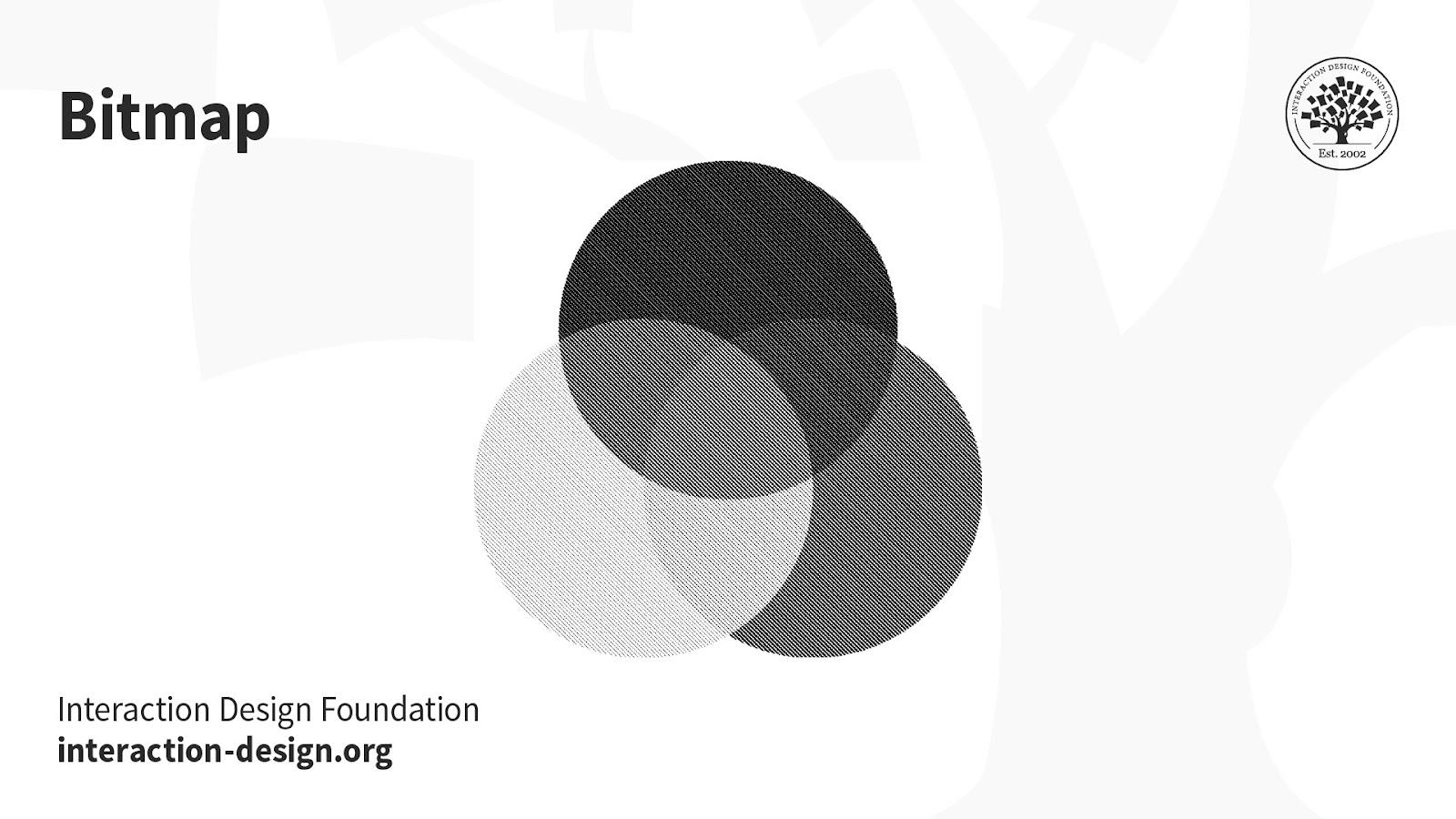
Bitmap (a.k.a. line art): This mode comprises black and white pixels, with no colors or shades of grey.
In digital formats, black and white values represent an image’s pixels, while black ink dots and the white of the paper represent the overall image in print formats.
Uses:
Print and digital formats to create a line drawing or hand-drawn sketch or make vintage effects.
While jagged-edged on-screen, bitmap images usually print smoothly with high resolution.
In this course, you will gain a holistic understanding of visual design and increase your knowledge of visual principles, color theory, typography, grid systems and history. You’ll also learn why visual design is so important, how history influences the present, and practical applications to improve your own work. These insights will help you to achieve the best possible user experience.
In the first lesson, you’ll learn the difference between visual design elements and visual design principles. You’ll also learn how to effectively use visual design elements and principles by deconstructing several well-known designs.
In the second lesson, you’ll learn about the science and importance of color. You’ll gain a better understanding of color modes, color schemes and color systems. You’ll also learn how to confidently use color by understanding its cultural symbolism and context of use.
In the third lesson, you’ll learn best practices for designing with type and how to effectively use type for communication. We’ll provide you with a basic understanding of the anatomy of type, type classifications, type styles and typographic terms. You’ll also learn practical tips for selecting a typeface, when to mix typefaces and how to talk type with fellow designers.
In the final lesson, you’ll learn about grid systems and their importance in providing structure within design. You’ll also learn about the types of grid systems and how to effectively use grids to improve your work.
You’ll be taught by some of the world’s leading experts. The experts we’ve handpicked for you are the Vignelli Distinguished Professor of Design Emeritus at RIT R. Roger Remington, author of “American Modernism: Graphic Design, 1920 to 1960”; Co-founder of The Book Doctors Arielle Eckstut and leading color consultant Joann Eckstut, co-authors of “What Is Color?” and “The Secret Language of Color”; Award-winning designer and educator Mia Cinelli, TEDx speaker of “The Power of Typography”; Betty Cooke and William O. Steinmetz Design Chair at MICA Ellen Lupton, author of “Thinking with Type”; Chair of the Graphic + Interactive communication department at the Ringling School of Art and Design Kimberly Elam, author of "Grid Systems: Principles of Organizing Type.”
Throughout the course, we’ll supply you with lots of templates and step-by-step guides so you can go right out and use what you learn in your everyday practice.
In the “Build Your Portfolio Project: Redesign,” you’ll find a series of fun exercises that build upon one another and cover the visual design topics discussed. If you want to complete these optional exercises, you will get hands-on experience with the methods you learn and in the process you’ll create a case study for your portfolio which you can show your future employer or freelance customers.
You can also learn with your fellow course-takers and use the discussion forums to get feedback and inspire other people who are learning alongside you. You and your fellow course-takers have a huge knowledge and experience base between you, so we think you should take advantage of it whenever possible.
You earn a verifiable and industry-trusted Course Certificate once you’ve completed the course. You can highlight it on your resume, your LinkedIn profile or your website.
UI Color Palette 2023: Best Practices, Tips, and Tricks for Designers
When it comes to user interface (UI) design, color plays an important role. It enhances aesthetics, shapes the user expe
390 shares
1 mth ago
Open Access - Link to us!
We believe in Open Access and the democratization of knowledge. Unfortunately, world class educational materials such as this page are normally hidden behind paywalls or in expensive textbooks.
If you want this to change,
, link to us, or join us
to help democratize design knowledge!