Color symbolism is the subjective meaning humans attach to various colors. People respond to color in three ways—biologically (e.g., red = fear), culturally (e.g., red = wellbeing in many Eastern societies) and personally from experience. Designers use color symbolism in (e.g.) logos to gain users’ trust and attention.
“Depending on context, colour can convey meaning often more effectively than words.”
— Zena O’Connor, Ph.D. in human responses to color, who established Design Research Associates
See why color symbolism matters greatly in design.
ShowHide
video transcript
Transcript loading...
Color’s Compelling Mystery
Color is a powerful tool for evoking emotions, expressing thoughts and communicating with—and persuading—your users, but its symbolism is subjective and depends on the context. How humans react to color is complex, stemming from our:
Biological response: For example, the color red can inspire fear and sexual desire, while blue light can help psychologically.
Cultural response: Different cultures value certain colors differently. Western societies typically esteem blue well above yellow; Eastern ones tend to prize yellow and see red without alarming or erotic overtones.
Personal associations with color: Our experiences can color our view of certain colors—e.g., someone’s childhood skiing accident might permanently scar their appreciation of white.
When designing, you can conjure a multitude of meanings through your color choices. Brand logos and colors need to resonate with the target audiences. So, industry and global market location are among the factors designers consider for leveraging color symbolism according to widely accepted associations, notably these:
Remember, context is key. And, while most “facts” about color psychology lack scientific basis, a deeper look at the palette can reveal some essential insights:
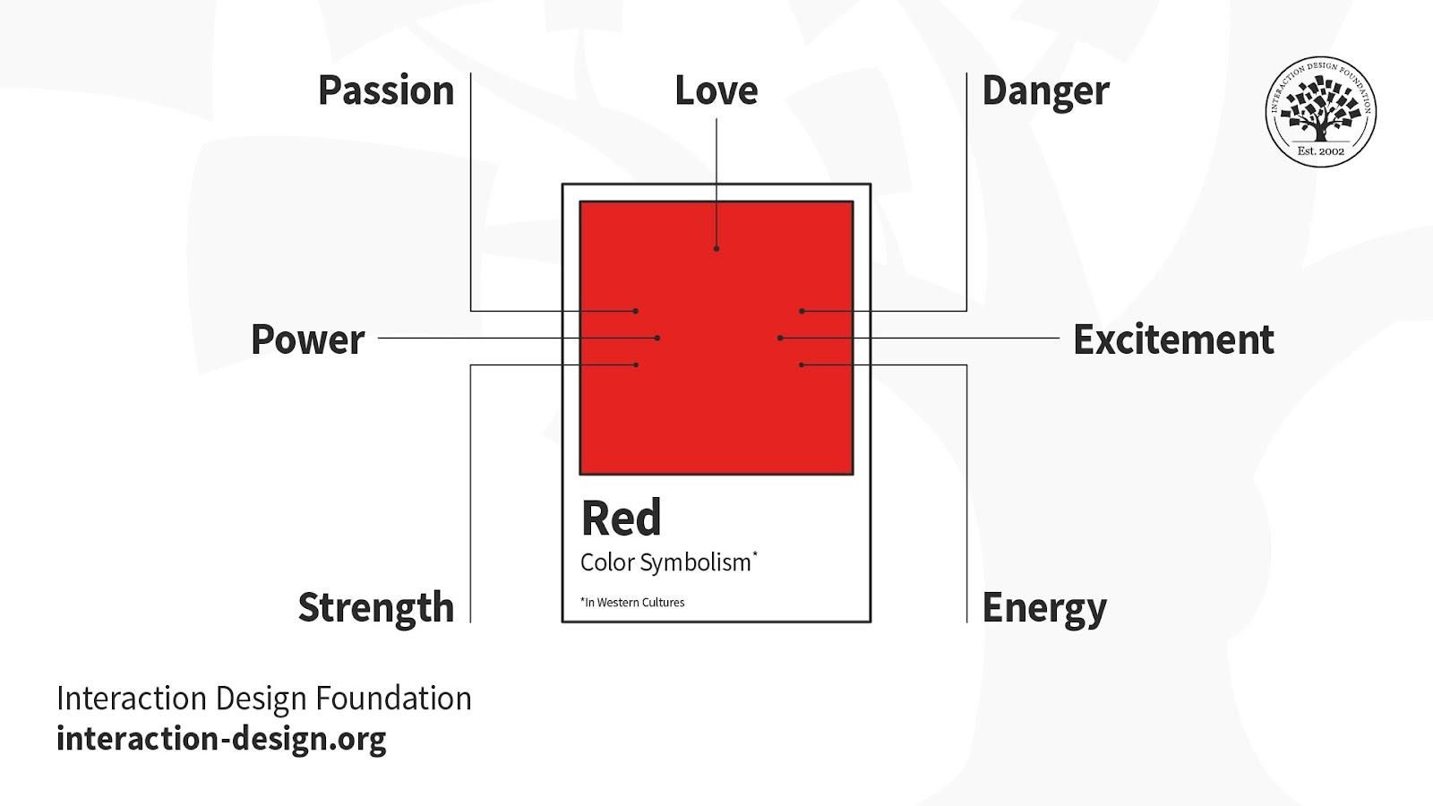
Red – Scarlet and crimson are among the variations that make red sexy and dangerous to Western eyes. Red may be bloody and arresting in the form of revolutionary rage and wounded bank balances, but red’s far less dramatic to Eastern eyes.
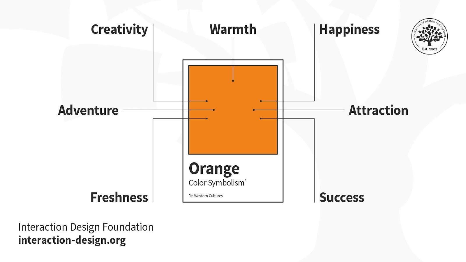
Orange – Linked with creativity and happiness, orange declares national and religious identity and defines athletic applications. Like red, it can grab attention (e.g., prisoner jumpsuits). Consider it for youthful, energetic brands as opposed to luxury, traditional or serious ones.
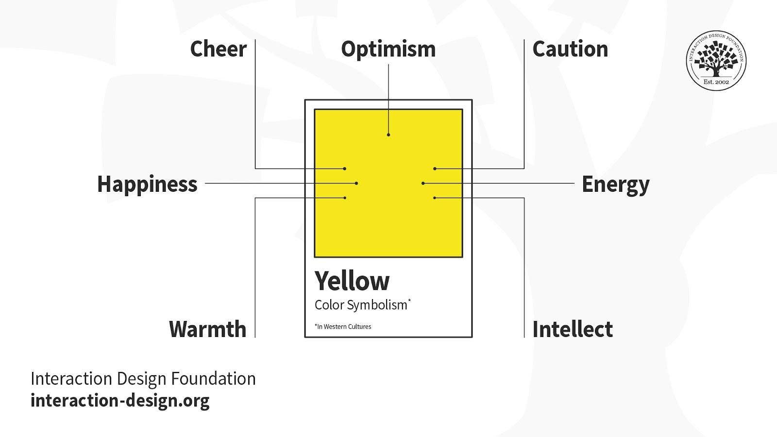
Yellow – The color of the Sun highlights with eye-catching warmth. Yellow can represent happiness, warmth, alarm, sickness, cowardice; take your pick. Some shades can look cheap, though, so it’s a noteworthy example of the need to research users’/customers’ reactions.
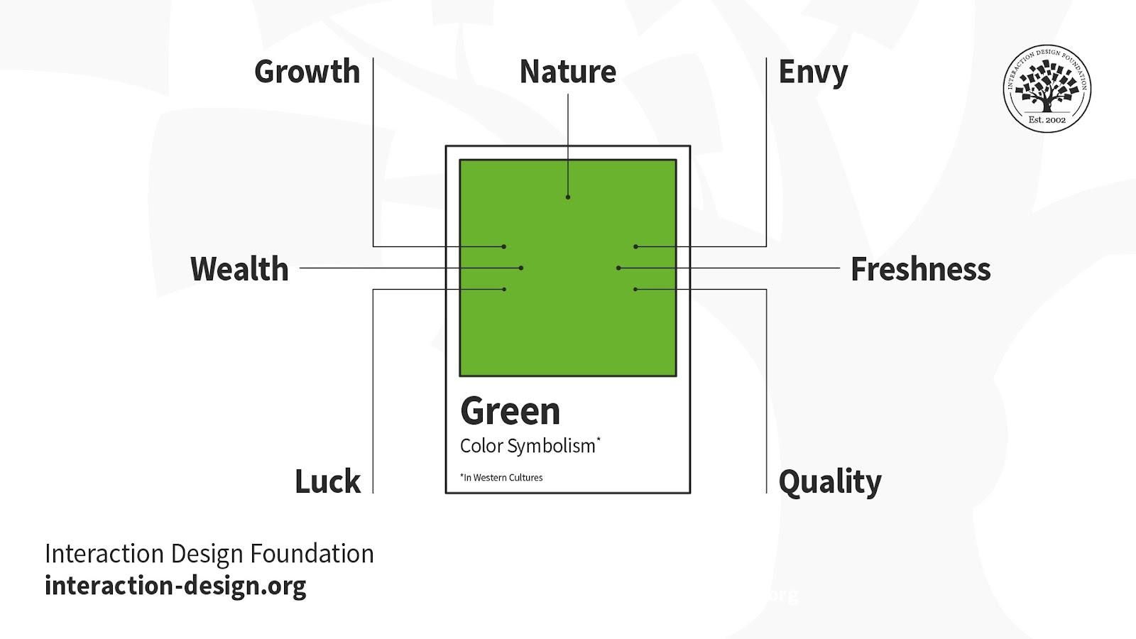
Green – It’s the color of Mother Nature and her life-sustaining bounty, with connotations of recycling and healthy finances. Green also means “proceed”; but there’s also inexperience and envy. The shade matters. Brighter, lighter greens indicate growth, vitality and renewal; darker, richer greens represent prestige, wealth and abundance.
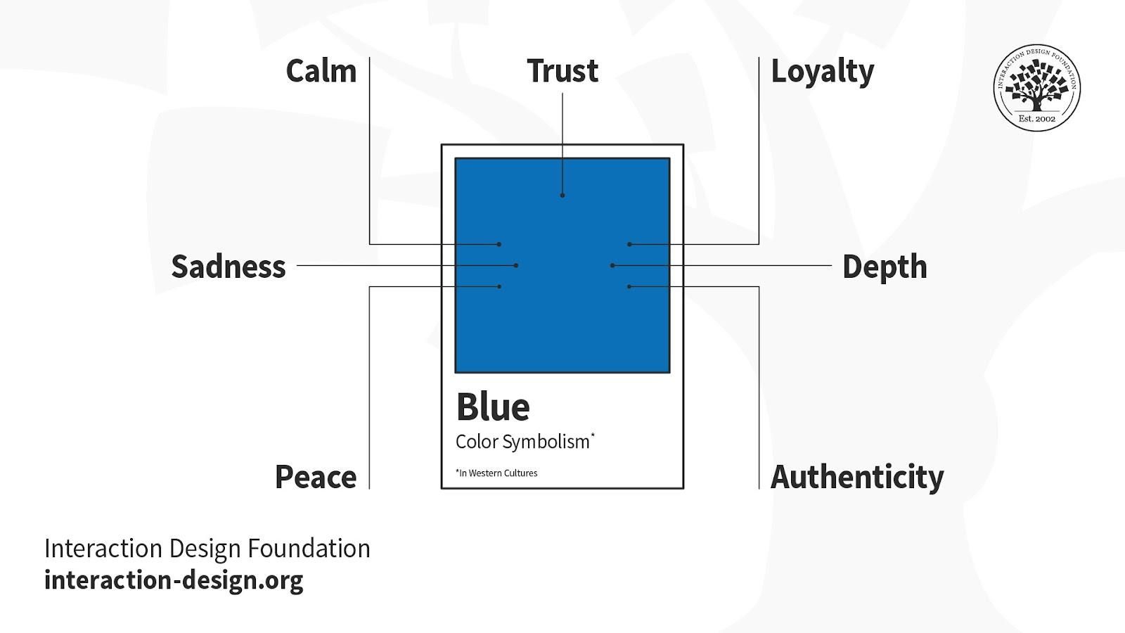
Blue – People find blue trustworthy, assuring, calming and masculine. It’s a tranquil sea and peaceful wonder at the sky; but then it can “mood-swing” to depression. You can bank on blue for designing financial and corporate dependability, although the right shade is vital.
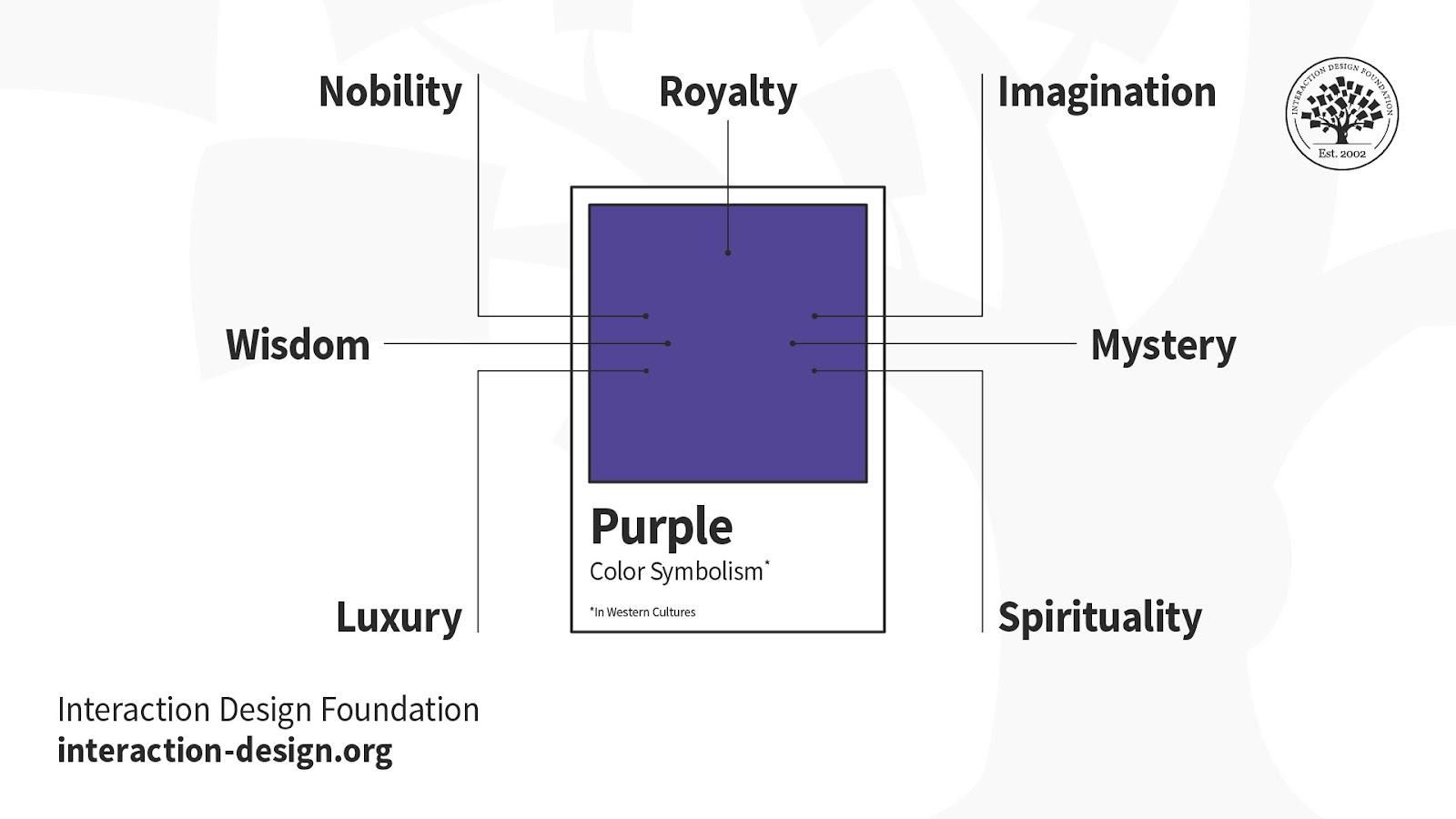
Purple – Long associated with royalty, purple connotes luxury and indulgence. But its majesty doesn’t always translate to design; for example, only women favor it as a top-tier color. Purple is uncommon in branding.
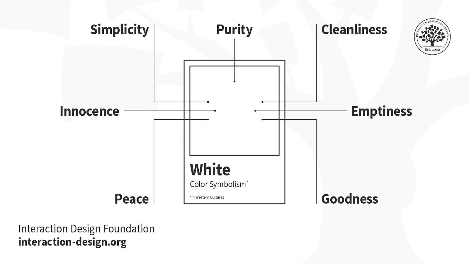
White – Cleanliness, goodness, innocence and simplicity are all associated with white. It’s as pure as a fresh snowfall, yet it signifies mourning in the East and means surrender internationally. Although innately positive, white lacks a dynamic personality, so it’s best left for brands that are indeed pure, simple and transparent.
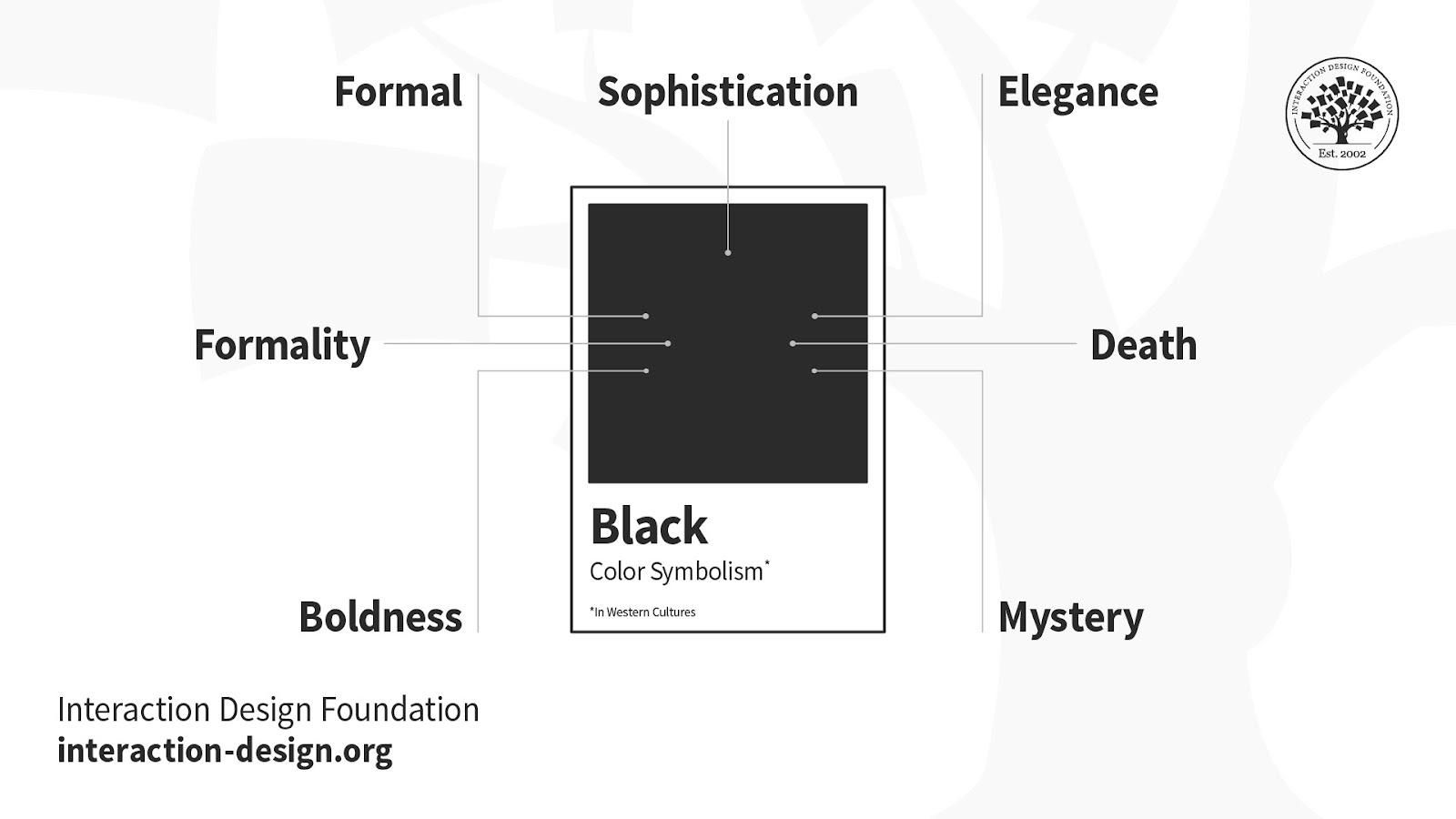
Black – Black means serious business, with overtones of severity and mystery, of death and grief. However, its inherent darkness doesn’t always convey negativity. It’s also a positive bank balance and smart, attractive clothing. It’s best to consider contrasting it with a bright color: gold for luxury or white for a bold, simple statement. Also, its texture and glossiness can influence your brand’s message.
Lastly, the colors you choose need to match your users and their sensibilities, not your personal preferences.
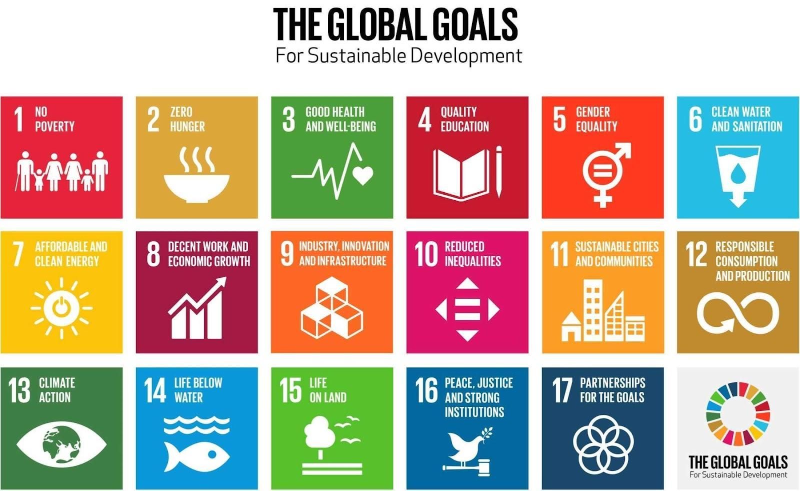
A notable example of the application of color symbolism is the icons for The Global Goals. This project, undertaken by designer Jakob Trollbäck, head of Trollbäck + Company, made the old Sustainable Development Goals for eliminating world hunger, etc., more universally resonating. The highly symbolic designs and palette carefully consider cross-cultural relevance and serve as part of the hopeful language to inspire everyone, everywhere to act for improvements and equality in the lives of people across the planet.
In this course, you will gain a holistic understanding of visual design and increase your knowledge of visual principles, color theory, typography, grid systems and history. You’ll also learn why visual design is so important, how history influences the present, and practical applications to improve your own work. These insights will help you to achieve the best possible user experience.
In the first lesson, you’ll learn the difference between visual design elements and visual design principles. You’ll also learn how to effectively use visual design elements and principles by deconstructing several well-known designs.
In the second lesson, you’ll learn about the science and importance of color. You’ll gain a better understanding of color modes, color schemes and color systems. You’ll also learn how to confidently use color by understanding its cultural symbolism and context of use.
In the third lesson, you’ll learn best practices for designing with type and how to effectively use type for communication. We’ll provide you with a basic understanding of the anatomy of type, type classifications, type styles and typographic terms. You’ll also learn practical tips for selecting a typeface, when to mix typefaces and how to talk type with fellow designers.
In the final lesson, you’ll learn about grid systems and their importance in providing structure within design. You’ll also learn about the types of grid systems and how to effectively use grids to improve your work.
You’ll be taught by some of the world’s leading experts. The experts we’ve handpicked for you are the Vignelli Distinguished Professor of Design Emeritus at RIT R. Roger Remington, author of “American Modernism: Graphic Design, 1920 to 1960”; Co-founder of The Book Doctors Arielle Eckstut and leading color consultant Joann Eckstut, co-authors of “What Is Color?” and “The Secret Language of Color”; Award-winning designer and educator Mia Cinelli, TEDx speaker of “The Power of Typography”; Betty Cooke and William O. Steinmetz Design Chair at MICA Ellen Lupton, author of “Thinking with Type”; Chair of the Graphic + Interactive communication department at the Ringling School of Art and Design Kimberly Elam, author of "Grid Systems: Principles of Organizing Type.”
Throughout the course, we’ll supply you with lots of templates and step-by-step guides so you can go right out and use what you learn in your everyday practice.
In the “Build Your Portfolio Project: Redesign,” you’ll find a series of fun exercises that build upon one another and cover the visual design topics discussed. If you want to complete these optional exercises, you will get hands-on experience with the methods you learn and in the process you’ll create a case study for your portfolio which you can show your future employer or freelance customers.
You can also learn with your fellow course-takers and use the discussion forums to get feedback and inspire other people who are learning alongside you. You and your fellow course-takers have a huge knowledge and experience base between you, so we think you should take advantage of it whenever possible.
You earn a verifiable and industry-trusted Course Certificate once you’ve completed the course. You can highlight it on your resume, your LinkedIn profile or your website.
Crafting a seamless and visually appealing user experience (UX) hinges on the art of selecting colors. Complementary col
74 shares
21 hours ago
Open Access - Link to us!
We believe in Open Access and the democratization of knowledge. Unfortunately, world class educational materials such as this page are normally hidden behind paywalls or in expensive textbooks.
If you want this to change,
, link to us, or join us
to help democratize design knowledge!