Design guidelines are sets of recommendations on how to apply design principles to provide a positive user experience. Designers use such guidelines to judge how to adopt principles such as intuitiveness, learnability, efficiency and consistency so they can create compelling designs and meet and exceed user needs.
ShowHide
video transcript
Transcript loading...
Find out how design guidelines help us craft successful designs, and how to adapt them to suit the content in creative ways.
Design Guidelines – An Essential Bridge between Principle and Judgment
Over many years, cognitive psychologists provided the foundations of many design guidelines through findings from their studies. Still other design guidelines exist thanks simply to common sense. For example, users can tell when a webpage looks too busy the moment they see it. So, designers should also be able to tell, and understand why. Design guidelines fall into several groups, including these:
Style – e.g., brand logos, colors
Layout – e.g., grid or list structure
User interface (UI) components – e.g., menus, buttons
Text – e.g., font, tone, labels/fields
Accessibility – e.g., Aria markup for disabled users
Design guidelines are rules of thumb for you to create work which never frustrates users. Likewise, you should also cater to users who have a wide range of disabilities. How you apply design guidelines also depends on the contexts of use, your design’s platform and the type of interaction users will have with it (e.g., voice-controlled).
Industry pioneers such as Don Norman and Jakob Nielsen identified areas which designers and developers should consider to design products that offer the best user experience. Here’s an example of how a designer might realize one of Jakob Nielsen’s ten design principles.
Design principle: Provide plain-language error messages to pinpoint problems and likely solutions.
Design Guideline: Write large-lettered, jargon-free text in web-safe font. Use short sentences and draw users’ attention to causes and remedies.
Design rule: Use 20-pt, black Georgia on lavender background (#e6e6fa Hex). Put instructions in bold.
Note the differences. The principles represent general points of direction. The guidelines reveal how to approach these. The rules are direct instructions. So, the designer approaches the design principles and then uses design guidelines to determine the design rules. Designers often apply design guidelines subjectively when they design products. One designer might interpret a guideline differently from another.
At the Interaction Design Foundation, we follow the design principle that we use recognition rather than recall. So, we have a design guideline to always show you where you are inside a course -so you don’t have to remember.
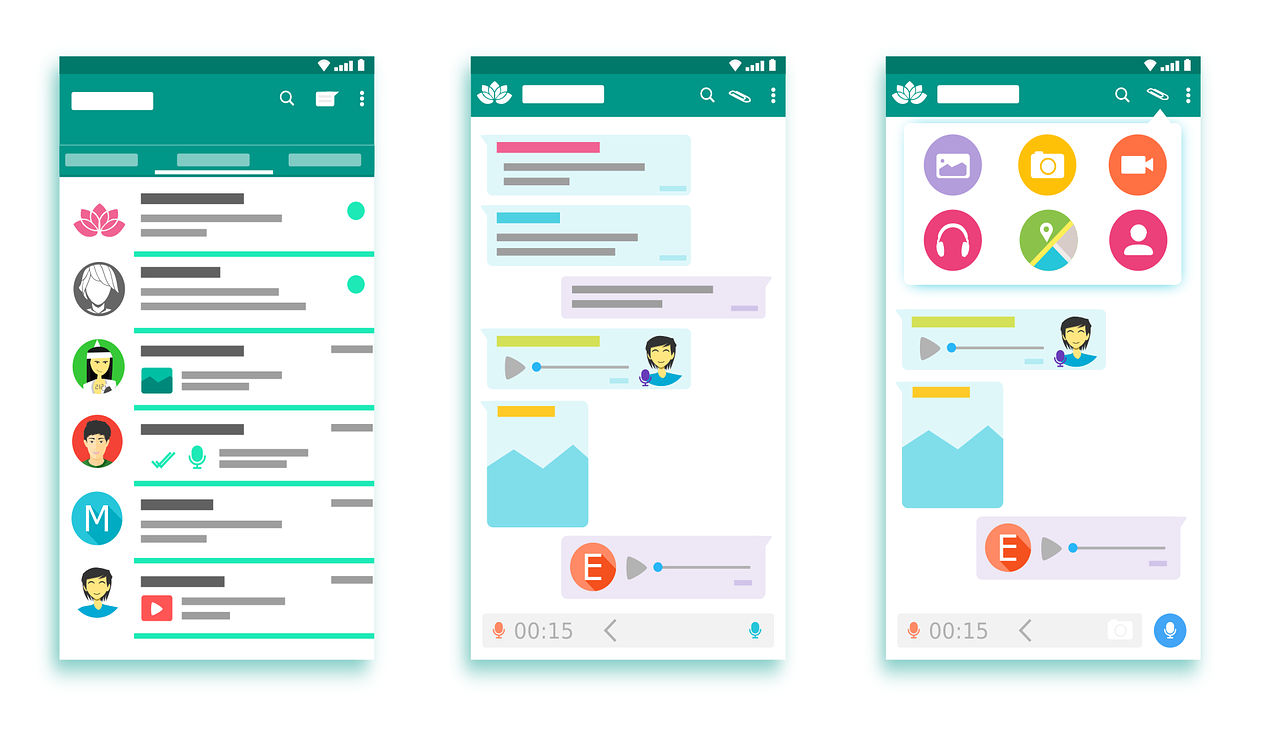
It’s vital to give users what’s most fit for purpose. Brands have various guidelines for designers to tailor dashboards to minimize cognitive load and maximize readability. Microsoft, Apple and Google are examples of companies that have exemplary standards (e.g., Google’s Material Design) for use in customization. Designers also have to accommodate users’ cultural considerations (e.g., color use and text direction). Moreover, when you design for mobile devices, you have to balance between brand consistency and maximal use of limited screen space. That’s why designers often use pictures or icons to represent information on mobile designs.
Author/Copyright holder: 200 Degrees. Copyright terms and licence: CCO.
Google’s Material Design is a good example of company specific design guidelines that relates both to branding and user experience.
In all cases, it’s best to apply design guidelines with care, where you balance user data and insights with brand directives to create designs that users find intuitive and pleasurable.
“Learn the rules like a pro, so you can break them like an artist.”
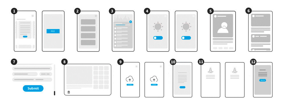
Have you ever found yourself spotting shapes in the clouds? That is because people are hard-wired to recognize patterns, even when there are none. It’s the same reason that we often think we know where to click when first experiencing a website—and get frustrated if things aren’t where we think they should be. Choosing the right user interface design pattern is crucial to taking advantage of this natural pattern-spotting, and this course will teach you how to do just that.
User interface design patterns are the means by which structure and order can gel together to make powerful user experiences. Structure and order are also a user’s best friends, and along with the fact that old habits die hard (especially on the web), it is essential that designers consider user interfaces very carefully before they set the final design in stone. Products should consist of such good interactions that users don’t even notice how they got from point A to point B. Failing to do so can lead to user interfaces that are difficult or confusing to navigate, requiring the user to spend an unreasonable amount of time decoding the display—and just a few seconds too many can be “unreasonable”—rather than fulfilling their original aims and objectives.
While the focus is on the practical application of user interface design patterns, by the end of the course you will also be familiar with current terminology used in the design of user interfaces, and many of the key concepts under discussion. This should help put you ahead of the pack and furnish you with the knowledge necessary to advance beyond your competitors.
So, if you are struggling to decide which user interface design pattern is best, and how you can achieve maximum usability through implementing it, then step no further. This course will equip you with the knowledge necessary to select the most appropriate display methods and solve common design problems affecting existing user interfaces.
Web UI Design Examples: Inspire Your Next Project with Stunning Designs
Web user interface (UI) design is an art that marries aesthetics with functionality. It's a digital landscape where colo
373 shares
3 mths ago
Open Access - Link to us!
We believe in Open Access and the democratization of knowledge. Unfortunately, world class educational materials such as this page are normally hidden behind paywalls or in expensive textbooks.
If you want this to change,
, link to us, or join us
to help democratize design knowledge!


