Grid systems are aids designers use to build designs, arrange information and make consistent user experiences. They include rule of thirds, golden section, single-column, multi-column, modular, baseline and responsive grid systems. For example, responsive adapts content to screen size and orientation, for consistency.
“One must learn how to use the grid; it is an art that requires practice.”
― Josef Müller-Brockmann, Graphic designer, author, educator and International Typographic Style pioneer
See why grid systems are invaluable aids.
Grids provide Stability, Consistency and Familiarity
For centuries, grids have played a vital role in displaying information optimally. From publishing to graphic design and UI design, grids remain extremely useful for helping organize design elements best. Low-tech and inexpensive, they’re also essential to keeping users happy and securing their trust for designers’ brands.
In visual design, a grid system helps you align screen elements based on sequenced columns and rows. Like making a map, you apply the column-based structure of a grid system to guide your design, structuring your text, images and functions consistently throughout it so they can appear instantly recognizable elsewhere. A reassuringly varied selection of grid systems exists. The key is to pick the right one for the right project.
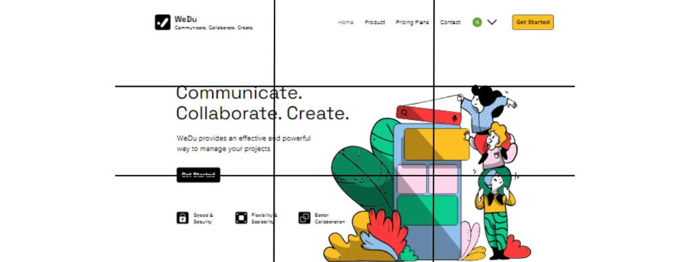
Rule of Thirds – This grid system splits content evenly into thirds, horizontally and vertically. You put your design elements at the intersection of those dividing lines or along one of the lines. Used effectively in (e.g.) cinema, it’s a tried-and-tested way to catch users’ eyes and access them in familiar visual terms.
Golden Section – Or Golden Ratio, it’s a long-established mathematical ratio used by artists and architects for over 2,000 years. Its formula is: Side A is to side B as side B is to sides A+B, which equates to a ratio of 1:1.618. Featuring frequently in nature, the golden section can please users’ eyes with organic and natural-looking design compositions.
Single-Column – The simplest grid, it comprises a single column of text surrounded by margins. It’s the default for new documents in page layout programs, and typically appears in books where single columns of text appear in spreads (facing pages).
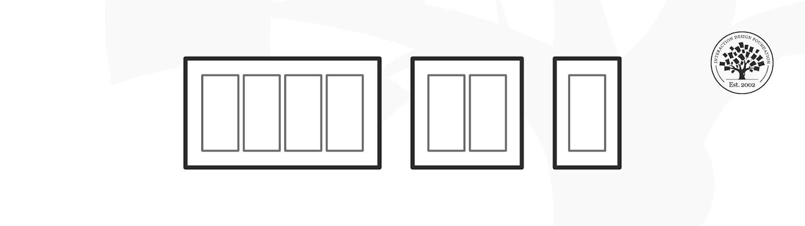
Multi-Column – These grids provide flexible formats for publications with a complex hierarchy or that integrate text and illustrations. The more columns you create, the more flexible your grid becomes. You can use the grid to articulate the hierarchy of the publication by creating zones for different kinds of content. A text or image can occupy a single column, or span several. Not all the space has to be filled.
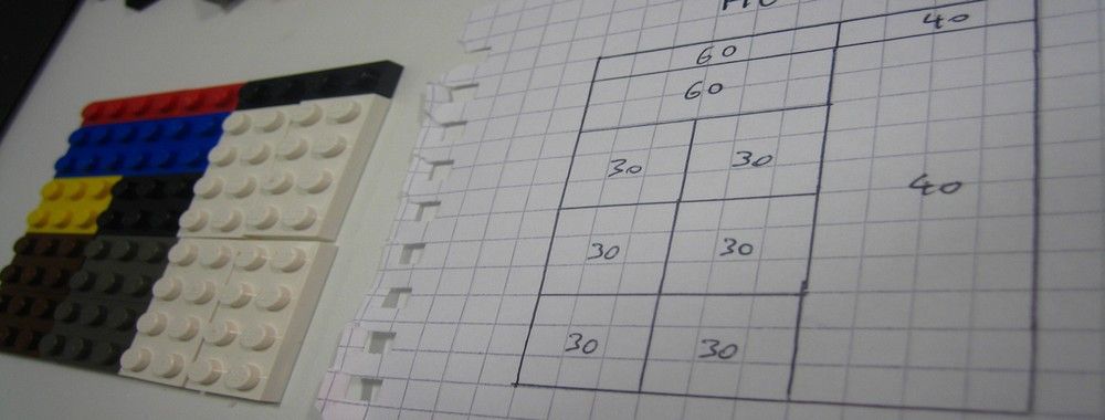
Modular – This type has consistent horizontal divisions from top to bottom as well as vertical divisions from left to right. These modules govern the placement and cropping of pictures and text. You split the page into several columns according to the content. Then, you divide the page from top to bottom in several rows. This combination assures continuity throughout the design. You can enhance the clarity of your message by how you place text on the grid. The modular grid offers infinite ways of doing this, although it takes some learning to use it best.
Baseline – This grid system comprises horizontal guidelines that govern the entire document. Baseline grids help you anchor all (or nearly all) layout elements to a common rhythm. To make one, choose the type size and leading of your text: e.g., 10-pt Scala Pro with 12 pts leading (10/12). Avoid auto leading; you can work with whole numbers that multiply and divide cleanly, then. Use this line space increment to set the baseline grid in your document preferences.
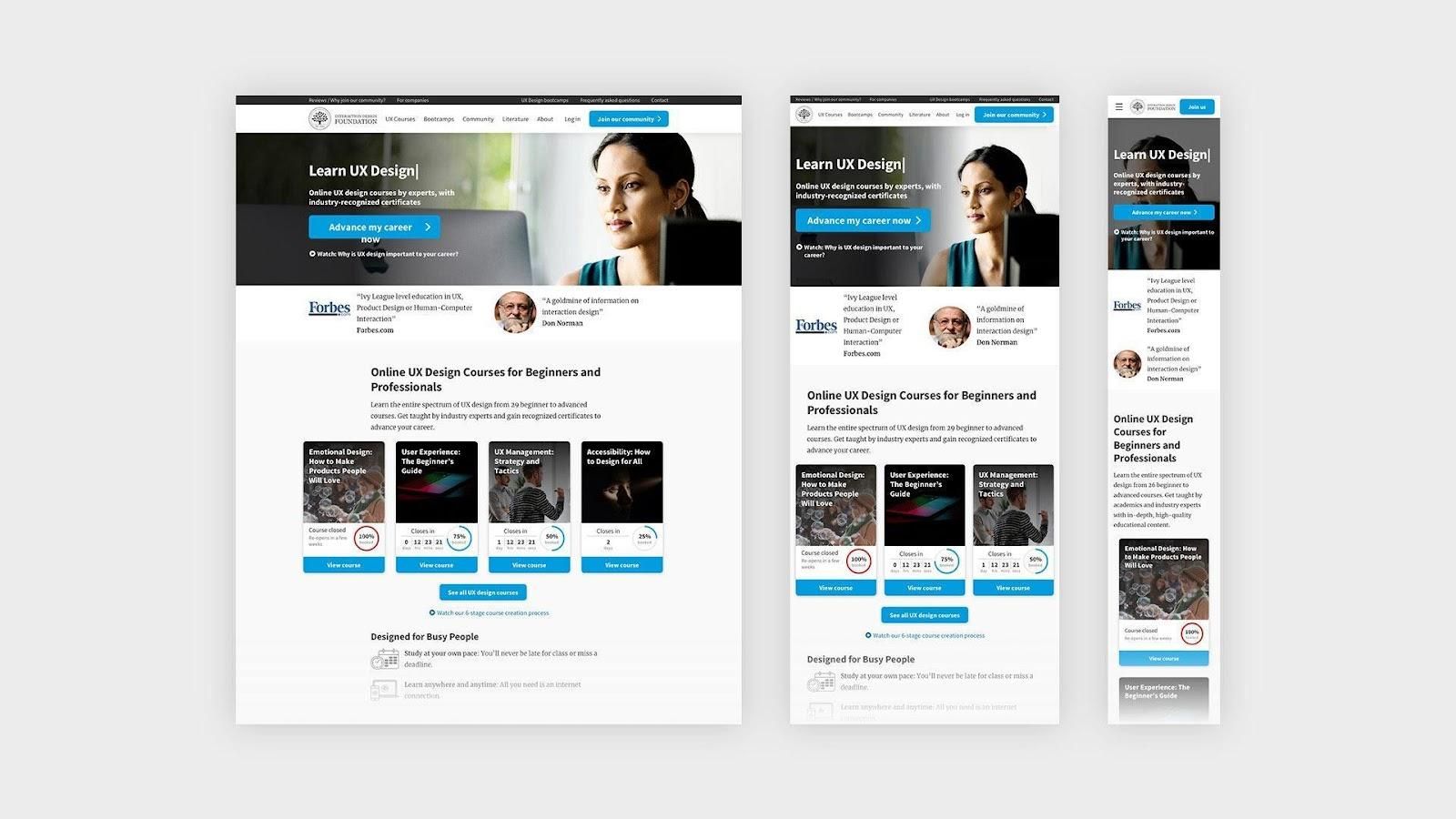
Responsive – This grid system adapts to screen size and orientation, ensuring consistency across layouts. Responsive grids typically comprise three elements: columns (areas that the content occupies), gutters (gaps between columns) and margins (spaces that add padding between the page contents and the viewport edges). The configuration of columns, gutters and margins changes depending on the screen’s width. A breakpoint is the range of predetermined screen sizes that have specific layout requirements. At a given breakpoint range, the layout adjusts to match the screen size and orientation. Each breakpoint range determines the number of columns, and recommended margins and gutters, for each screen size.
In this course, you will gain a holistic understanding of visual design and increase your knowledge of visual principles, color theory, typography, grid systems and history. You’ll also learn why visual design is so important, how history influences the present, and practical applications to improve your own work. These insights will help you to achieve the best possible user experience.
In the first lesson, you’ll learn the difference between visual design elements and visual design principles. You’ll also learn how to effectively use visual design elements and principles by deconstructing several well-known designs.
In the second lesson, you’ll learn about the science and importance of color. You’ll gain a better understanding of color modes, color schemes and color systems. You’ll also learn how to confidently use color by understanding its cultural symbolism and context of use.
In the third lesson, you’ll learn best practices for designing with type and how to effectively use type for communication. We’ll provide you with a basic understanding of the anatomy of type, type classifications, type styles and typographic terms. You’ll also learn practical tips for selecting a typeface, when to mix typefaces and how to talk type with fellow designers.
In the final lesson, you’ll learn about grid systems and their importance in providing structure within design. You’ll also learn about the types of grid systems and how to effectively use grids to improve your work.
You’ll be taught by some of the world’s leading experts. The experts we’ve handpicked for you are the Vignelli Distinguished Professor of Design Emeritus at RIT R. Roger Remington, author of “American Modernism: Graphic Design, 1920 to 1960”; Co-founder of The Book Doctors Arielle Eckstut and leading color consultant Joann Eckstut, co-authors of “What Is Color?” and “The Secret Language of Color”; Award-winning designer and educator Mia Cinelli, TEDx speaker of “The Power of Typography”; Betty Cooke and William O. Steinmetz Design Chair at MICA Ellen Lupton, author of “Thinking with Type”; Chair of the Graphic + Interactive communication department at the Ringling School of Art and Design Kimberly Elam, author of "Grid Systems: Principles of Organizing Type.”
Throughout the course, we’ll supply you with lots of templates and step-by-step guides so you can go right out and use what you learn in your everyday practice.
In the “Build Your Portfolio Project: Redesign,” you’ll find a series of fun exercises that build upon one another and cover the visual design topics discussed. If you want to complete these optional exercises, you will get hands-on experience with the methods you learn and in the process you’ll create a case study for your portfolio which you can show your future employer or freelance customers.
You can also learn with your fellow course-takers and use the discussion forums to get feedback and inspire other people who are learning alongside you. You and your fellow course-takers have a huge knowledge and experience base between you, so we think you should take advantage of it whenever possible.
You earn a verifiable and industry-trusted Course Certificate once you’ve completed the course. You can highlight it on your resume, your LinkedIn profile or your website.
Picture this: You want to design a stunning graphic or capture a momentous photograph. You want to ensure that your visu
387 shares
1 mth ago
Open Access - Link to us!
We believe in Open Access and the democratization of knowledge. Unfortunately, world class educational materials such as this page are normally hidden behind paywalls or in expensive textbooks.
If you want this to change,
, link to us, or join us
to help democratize design knowledge!


